Page 1 of 2
Project 1 Roughs
Posted: Thu Feb 08, 2018 4:01 pm
by AboutDead
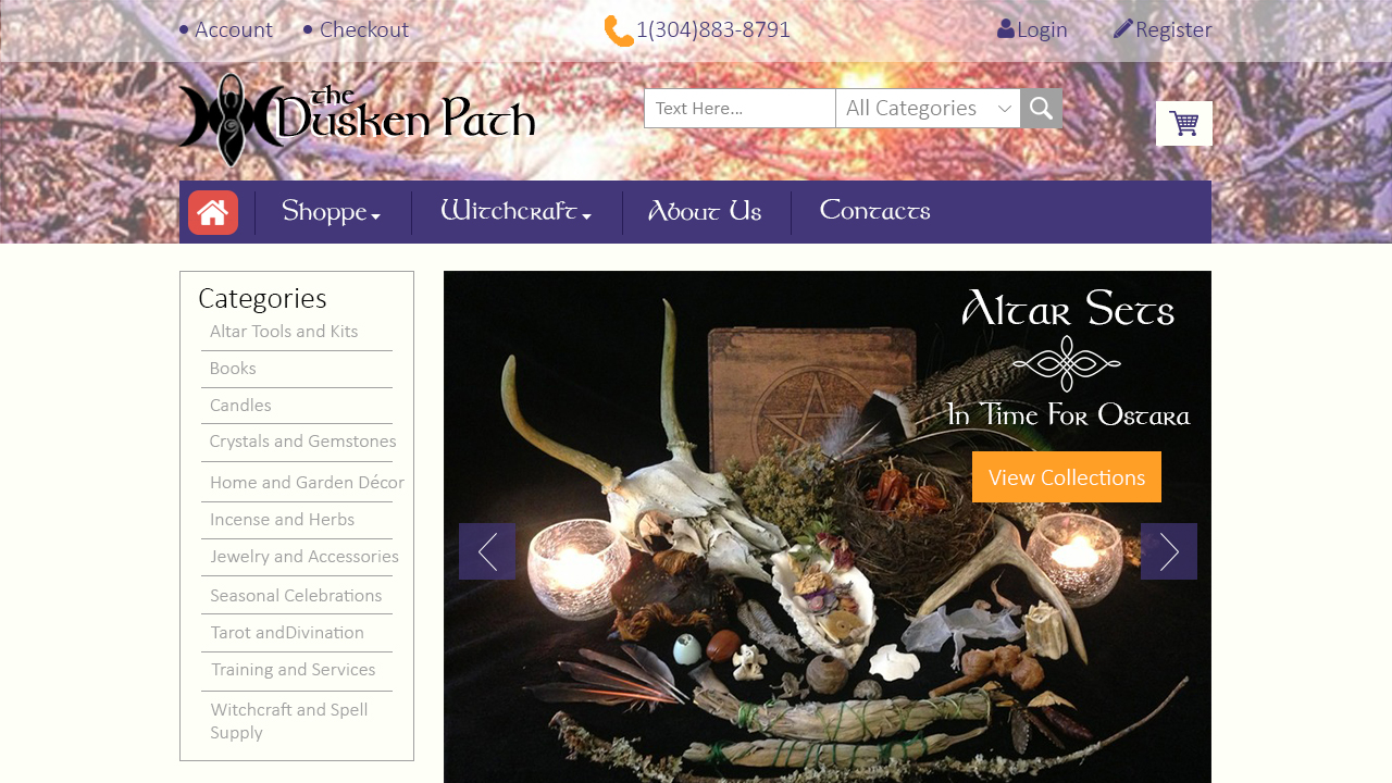
For project one, I decided to create a website dedicated to selling both traditional and contemporary witchcraft supplies as well as providing knowledge and information regarding the craft. I chose to name my website "Dusken Path" to evoke a sense of wonder in the viewer. The color palette I chose makes use of browns, reds, yellows, and violets as well as the base colors of white and black. My logo is a combination of the
Triple Moon, a symbol depicting the female figure and her life cycle as
The Maiden, The Mother, and The Crone, and the
Spiral Goddess, a neopagan symbol depicting the phases of the moon.
I took influence from these websites:
https://sacredmists.com/
https://www.13moons.com/
Re: Project 1 Roughs
Posted: Thu Feb 08, 2018 6:34 pm
by fjbo
WOW!
This is not rough at all, it's very realistic and feels pretty much ready to produce. In regards on which one to use, this is the one I like the most:

There is literally nothing that I could bring up, very very well done!
Re: Project 1 Roughs
Posted: Thu Feb 08, 2018 9:24 pm
by selvester
Wow these look great! I like your second rough more than the first though. I think it's more legible with the tan and white background boxes instead of the multicolored photo. If I had to suggest one thing, you might try a larger font size with Shoppe, it could pop off the photo a bit more.
Awesome work!
Re: Project 1 Roughs
Posted: Fri Feb 09, 2018 9:30 pm
by Marco horta
Hello Sarah, Your designs are awesome, it is very hard to have to select one of them. These designs are crazy, well done!. I would like to say go for the second one, the soft color selection goes well balance with the imagery. Just, I would like to see bigger your text on your menu bar.
Re: Project 1 Roughs
Posted: Sat Feb 10, 2018 9:54 am
by HouseStark
Hi Sarah,
Both layouts are very nice. I am leaning towards website 2 but I like the menu layout from website 1. Homepage for website 2 menu off the side - like the inner page. I like the font choices you made, goes very well with your website and I think the name "The Dusken Patch" could be a little larger. Good job!
Re: Project 1 Roughs
Posted: Sun Feb 11, 2018 11:45 am
by Stephski
Hi Sarah,
I love your rough two. The imagery used on the homepage work so well with the colors. It is a very warm and inviting website. I think it conveys perfectly a sense of wonder. It looks so great as is, I don't think it needs a change.
Re: Project 1 Roughs
Posted: Tue Feb 13, 2018 3:38 pm
by Instructor
Ooooh, these are some very professional looking roughs, Sarah. Well done.
These are super clean and ready to be built. I slightly prefer your second one. The parchment accent color works best with the Wicca supplies "shoppe" angle you're working here, I think. I also like the use of your logo and navigation font on the headline on your homepage. Your choice in photography is spot on and very evocative. I like the blend of artistic font with a traditional sans-serif. It's a pairing that's working very well for you. Your navigation is easy to see and use. I especially like the multiple levels of navigation. That goes a long way to establishing a hierarchy of content. Good use of some subtle transparency on your home page too.
I'd like to see the title of your inner page done in the logo and navigation font, similar to how you have it on your homepage. I also think this layout could benefit from a few subtle gradients and textures as well.
Nice work!
Re: Project 1 Roughs
Posted: Wed Feb 14, 2018 11:50 pm
by Eduardo_Garcia
Hello,
Both of your designs are very appealing!
I'd go with your website 1 rough, the header background image and color scheme make your design truly appealing!
Only advice I can give is to center the nav, since the right side is just empty spae
Re: Project 1 Roughs
Posted: Thu Feb 15, 2018 4:22 pm
by BecomeAHero
I can really tell you've put a lot of research into your store and the branding on both websites is amazing! If I were your client I would be very happy with both options!
If I have to pick one, I really like the second. Though I enjoy the imagery in your navbar in your first design, the layout of the second with the tan feels more polished. I think the type pops more in this design, and does a nice blend of old style tradition with a contemporary layout. Very nice!
Re: Project 1 Roughs
Posted: Thu Feb 15, 2018 5:12 pm
by chaytothet
I really like your first rough set. I think the picture in the nav bar brings a nice effect to the rest of the page, the second almost looks bland without it!