Page 1 of 1
Project 1 Preliminary Roughs
Posted: Fri Sep 13, 2024 11:15 am
by onnimelon2
Hi class. I chose Annie Atkins as the graphic designer to spot focus. Here's two design roughs. Thank you!

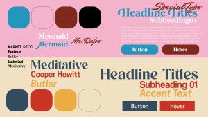
- Style Guides
Design Version 1 Home pages desktop & Mobile
Design Version 1 Gallery pages desktop & Mobile
Design Version 2 Home pages desktop & Mobile
Design Version 2 Gallery pages desktop & Mobile
- Alexandra Buyck GRC275
Re: Project 1 Preliminary Roughs
Posted: Sun Sep 15, 2024 11:48 am
by drkittenpagas
Hi Alexandra,
I love Annie Atkins too! I think your second design ties so nicely to what she does as an artist. I hope you keep working with that idea its so creative!
Re: Project 1 Preliminary Roughs
Posted: Mon Sep 16, 2024 1:52 pm
by ChloieKonrad
Hello Alexandra,
I really like the style of design two!
I would suggest adding a background color to the home page that is like the one on the gallery page. The white seems very bright against the ticket, and I think takes away from it a little bit.
Good Job!

Re: Project 1 Preliminary Roughs
Posted: Wed Sep 18, 2024 1:51 pm
by Emily-Hudson
Hi, Alexandra
I really like your ticket/yellow layout, it looks very visually pleasing.
The top of your mobile design is a bit cluttered, I think adding a separate navigation tab would assist in that issue.
If you go with the pink layout, I'd try to change the pink so that it isn't clashing too hard with the blue. Their values are too similar and it is a bit hard to look at.
Great work, looking forward to more!
Re: Project 1 Preliminary Roughs
Posted: Thu Sep 19, 2024 12:19 pm
by Olivia_haltom
Hello! I love the direction your design is going for the yellow layout. It's very bright and eye catching. Overall, your roughs are really well done!
Re: Project 1 Preliminary Roughs
Posted: Fri Sep 20, 2024 4:23 pm
by hazzie.jpg
Hi Alexandra,
I love your ticket concept. It’s super creative and really represents the designer. I’m wondering if you could make the gallery pages look more cohesive with the homepage design of the ticket. I’m thinking that perhaps you could make the buttons look like tickets or even just make the home button look like a ticket. I think that it’s just missing that one little linking piece that brings together the homepages with the other pages. Other than that, I think you’re doing a great job! Super creative, and I’m excited for the end product.
Re: Project 1 Preliminary Roughs
Posted: Fri Sep 20, 2024 11:30 pm
by PAmes
Hi Alexandra!
I love your second design so much It has a super fun energy about it and the colors contrast in a really nice way! Its very clean and the welcome ticket is very cute!
Hope you have a great night!
Re: Project 1 Preliminary Roughs
Posted: Sat Sep 21, 2024 12:00 am
by ngrunwald
Hi Alexandria, I really liked both of your layouts but I think the ticket idea was the best. Your designs look easy to navigate as well, the other designs have a good color scheme that is appealing to the eye. Overall, great work
Re: Project 1 Preliminary Roughs
Posted: Sun Sep 22, 2024 8:38 pm
by Instructor
Alexandra
It is always your choice to make the final decision.
Excellent job on your style guides! I like v2 for the creativity of it, I am not sure I prefer mustard yellow.
If you go with v2, would you make your yellow shapes the shape of a ticket?