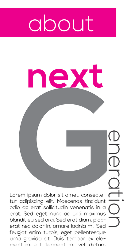
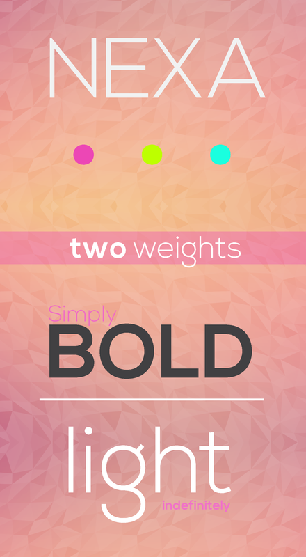
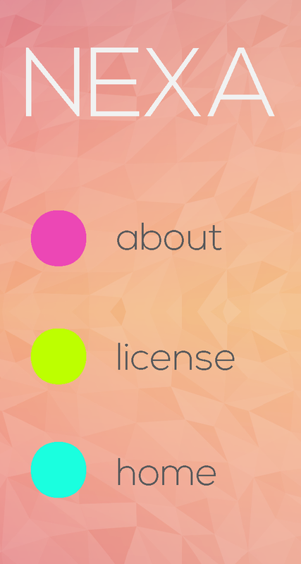
I have some roughs here. I honestly don't have someone or something I truly draw pure inspiration from. It all comes from here <3.....LOL anyways I decided to make a tribute website to one of my favorite fonts.
a tad late : P
- c.j.jackson775
- Posts: 48
- Joined: Thu Jan 29, 2015 6:26 pm
- Contact:
a tad late : P
Design may be king, but typography is the crown.
- Instructor
- Site Admin
- Posts: 480
- Joined: Tue Jan 03, 2012 9:50 am
- Location: Reno, Nevada
- Contact:
Re: a tad late : P
Just a tad!
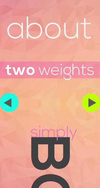
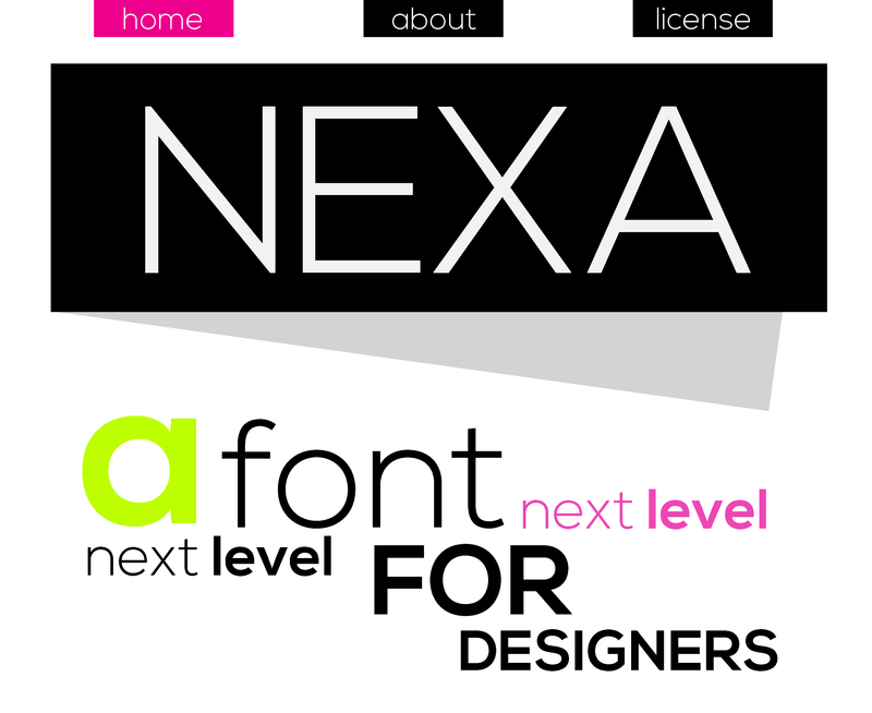
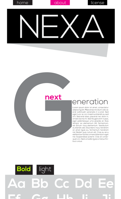
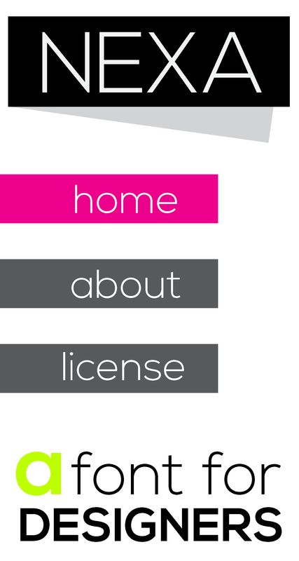
However the designs themselves were worth the wait. Both are excellent. I've never had a student be inspired by a font before, so this is uncharted ground. As neat as the stained glass look on your first design is, I'd say the high-contrast, new wave design of the second one speaks to Nexa and what it's about a bit better. The contrast and splashes of color really help move the eye around. I like the oversize drop-cap to start the paragraph. It makes a great focal point. The off center drop shadow is nice as well. It helps keep the design from getting stuck up it's own grid layout. The navigation is easy to use and ties into the page titling very well.
I'm not sold on the lime green highlight color. I think it clashes with the rest of the design a bit too much May be try something that's analagous to magenta. Perhaps an orange? I'd also enlarge your navigation buttons on the tablet version, since it's going to be navigated by big fat fingers, just like you mobile version.
I can't wait to see what this thing looks like live. The more live type the merrier!
If we feel useful in life and loved, it sure makes life significant and wonderful
Toni McDonough - GRC 275 Instructor
tmcdonough@tmcc.edu | 775-235-8234
Toni McDonough - GRC 275 Instructor
tmcdonough@tmcc.edu | 775-235-8234
Re: a tad late : P
For some reason I'm having a hard time distinguishing the pages of the pink background option, but I like it a more than the solid white background.
The pink design makes you want to look through your site where i don't get that feeling from the white background site.
I don't really like the Magenta, Yellow and Green dots for the navigation, maybe something a little more subtle. Possibly a hollow circle with a white border.
Good work!
The pink design makes you want to look through your site where i don't get that feeling from the white background site.
I don't really like the Magenta, Yellow and Green dots for the navigation, maybe something a little more subtle. Possibly a hollow circle with a white border.
Good work!
-Jonathon James
-
- Posts: 63
- Joined: Thu Jan 29, 2015 6:30 pm
Re: a tad late : P
Hi Chris,
I think I would of found "someone" to do the website about rather than "something".
So getting over that... and thinking about fonts.
I like the 2nd design with the white background.
The simplistic design looks good with the large fonts and body copy.
I would try to make the design a little more exciting with the fonts.
Maybe with adding photos of the artist/designers that designed the fonts your talking about.
Give it a little life!
Nice job,
Georgia
- elizabeth_mejia
- Posts: 57
- Joined: Thu Jan 29, 2015 6:28 pm
Re: a tad late : P
I really like the pink layout I like the dimensional shapes it has in the background. I think their might be contrast issues with the pink type so maybe change that to a different color like that bright blue you have. Nice layouts.
Elizabeth Mejia
-
- Posts: 73
- Joined: Thu Jan 29, 2015 6:31 pm
Re: a tad late : P
I am not sure if those work for the assignment, but your idea and roughs are unique, I like the layouts. I like your layout with the white background more, because the shapes and the type management and movements of the types are more interesting to me: )
- TsukiMizuDCC
- Posts: 52
- Joined: Thu Jan 29, 2015 6:30 pm
Re: a tad late : P
Really stepping out of the box, huh Chris,
Never would of thought of using a font as inspiration. I like the roughs. I'm leaning to the white background rough because it really stands out. Really easy to navigate. I'm having a little problem with the light green type on some parts of the site. The color rough is ok, but I'm having a little problem with the colors. Really messing with my eyes. But overall, great job.
Dalanie "TsukiMizu" Chester
Cosplayer/Artist/Daydreamer
"All work and no play makes the imagination a dull reality."
-Dalanie Chester
Cosplayer/Artist/Daydreamer
"All work and no play makes the imagination a dull reality."
-Dalanie Chester
Re: a tad late : P
I enjoy the second because It has less color and it's clean.
Re: a tad late : P
Good concept!
I like your rough 1.
You used background image effectively, and I really like the color you used.
Good job!
Kiwako
I like your rough 1.
You used background image effectively, and I really like the color you used.
Good job!
Kiwako
Re: a tad late : P
Hi Chris,
Super cool concept, great alternative to an inspirational figure! As a typeface that seems very clean and rounded, I feel like the first design is much more successful at representing that. I love that textured background, it gives the website a nice, subtle dimension. The colors are also delicate and not overpowering at all, while still being very visually interesting. My only suggestion is a value concern, the words "simply" and "indefinitely" might be a little difficult to read depending on the user, so try playing around with some alternative colors.
a s h l e y c h i s a m