Page 1 of 2
My products page
Posted: Sat Mar 14, 2015 12:29 am
by c.j.jackson775
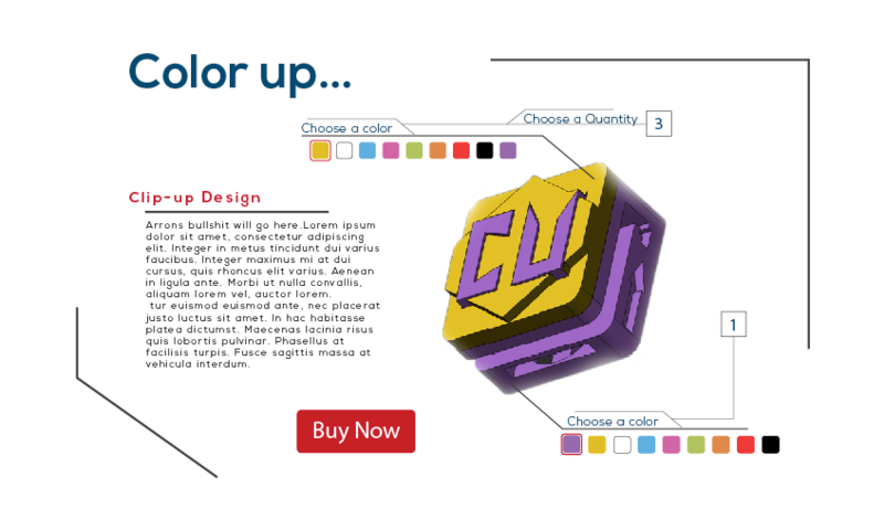
I know you've all seen this before but I sort of repurposed it because I didn't end up using it in my actual website. I added a quantity form and a buy now button. My 12 different products will be the various color combinations you can choose from. After clicking buy now it will redirect you to the shopping cart so you can check out. I'm thinking of adding an add to cart button on the end of the color pickers so you can add different colors to the cart. I also want to add a form that will show your subtotal before heading to the shopping cart.

Re: My products page
Posted: Tue Mar 17, 2015 4:18 am
by paulab
This is a nice design Chris. very clean. I think the "add to cart" button will be a good addition.
Re: My products page
Posted: Wed Mar 18, 2015 11:48 am
by mccuske2
It looks really nice. the color flows great together and your eye moves nicely around the pg.
Re: My products page
Posted: Wed Mar 18, 2015 11:49 pm
by lingling_chen
Great job,Chris. I think customers will like to see the price on the product detail page. Very good design page, thumbs up: )
Re: My products page
Posted: Thu Mar 19, 2015 1:33 pm
by recordd
Hi Chris! Great Job on your rough! It is designed professionally, organized, easy to order your product, and the image is eye catching. One thing that I would suggest is to add an add to cart button (like you said) instead of the buy now...otherwise love it and cannot wait to see your final site.

Re: My products page
Posted: Thu Mar 19, 2015 5:07 pm
by elizabeth_mejia
Still looks really nice, clean, and easy to understand. My only suggestion is to maker the Choose Quantity and Choose a color text a little bigger so it stands out more and is easier for the eye to see them faster.
Re: My products page
Posted: Thu Mar 19, 2015 9:35 pm
by Instructor
Hmmmmmm. I see only one layout here.

That being said, it is a particularly
good layout. I like the changes you've made to your layout. The accent lines work well as a framing device and eye guide. The text is large and easy to read. And the buy it now button is as large, shiny and tempting as the
History Eraser Button.
Not sold on the black, blue, red, and white color scheme. I'll have to see it in action, I guess.
Good work, sir. Wish there was an alternate, though.
Re: My products page
Posted: Thu Mar 19, 2015 10:08 pm
by aslychsm
Super cool! The whole concept immediately makes me want to start tinkering with all the customizable options. Very creative and professional. What's most important is that your users will really have a fun time fashioning their own product. I'm excited to see it completed!
Re: My products page
Posted: Tue Mar 24, 2015 1:04 pm
by Sierragirlnv
Ok, so I guess there are many ways to do this. I was thinking you had to have the shopping carts all on one page and then go to another page and fill out the credit card information? I guess there are a plethora of ways to do it. I see that you have them choose from the color and style and then check out, is that right? Anyways I like the design you give plenty of space between elements and it doesn't look too cluttered and there isn't any confusion. Good work!
Re: My products page
Posted: Wed Mar 25, 2015 12:14 am
by Siri
This is definitely one way to get customers to start tinkering with the site when they visit, and I think the addition of a subtotal and shopping cart option from the get-go would be a good idea. How many times have we all shopped online only to be startled by the total amount once we were checking out? Regardless, you're keeping the customers informed, and that's always a plus. I look forward to what the end result will be.

