Page 1 of 2
Project1--Dreamr
Posted: Tue Sep 18, 2012 5:56 pm
by BrandonBarringer
Re: Project1--Dreamr
Posted: Tue Sep 18, 2012 6:30 pm
by brienicole
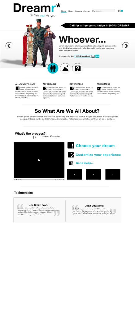
The second one is way better. I like the layout better. First one is too cluttery
Re: Project1--Dreamr
Posted: Tue Sep 18, 2012 6:58 pm
by kylesmith
I also like the second one better. I think it would be cool to get some more action shots in there like secret agent spy man stuff. Just to get the point across that it is the same thing as Total Recall. Texture would be cool in there too.
Re: Project1--Dreamr
Posted: Thu Sep 20, 2012 12:48 am
by vtat
The new edited one is great! I like the logo and the minimal style to the color choice. I'm Excited to see this as a complete site!

Re: Project1--Dreamr
Posted: Fri Sep 21, 2012 9:41 am
by treesa
I definitely like your second one better, cleaner and easier to understand
Re: Project1--Dreamr
Posted: Sun Sep 23, 2012 10:18 am
by MissTinaBodden
I really like your second design. The first design is cluttered and there is to much going on. I think if you add some of the great color you have in the first design to the second it will help bring it all together.
Re: Project1--Dreamr
Posted: Sun Sep 23, 2012 1:53 pm
by walters36
I as well like the second design. its simple and easy to view, instead of all busy. like the first design you have.
Re: Project1--Dreamr
Posted: Mon Sep 24, 2012 4:17 pm
by miss_kristine
I like the second design. Very clean and simple, pleasing to look at. It looks like a professional design. I like it better than your revised edit as well. I think the gray underneath the header in your revised version doesn't make sense and is distracting, but the inner page of this design is pleasing and good for video viewing, which it seems is what will be going there.
Re: Project1--Dreamr
Posted: Mon Sep 24, 2012 7:15 pm
by Instructor
Huh. Interesting. I see pieces of two designs that I think will go together really well.
Design 1
I really like the sky and cloud background and the clean top bar of this design. It makes such a nice, neat little presentation box for your content. The logo and navigation are easy to see, find, and use and it really conceptually sets the tone for what the website is all about. Unfortunately the content inside is a complete horror show. Too many images, scattered haphazardly all over the place. I'm not sure what's going on or where to start.
Design 2
A nice, clean, well layed out design. It's easy to use and find things. I like the high contrast and the little in jokes included throughout the design. But to me it seems to lack character. It's almost a little too clean and I have a tough time visualizing what your website is all about just looking at the imagery.
Summary
I think we've got a case of "a little of Column A, a little of Column B" here. I think combining the clean, easy to follow, layout of your second design with the nice visual framing from your first would make for a really nice looking website that tells it's story almost without having to look at it's text.
Re: Project1--Dreamr
Posted: Tue Sep 25, 2012 11:20 am
by wysiwyg
I love the colors and layout of everything.


