Page 1 of 1
Thank You
Posted: Tue Nov 27, 2012 3:31 pm
by BrandonBarringer
Re: Thank You
Posted: Tue Nov 27, 2012 5:14 pm
by brienicole
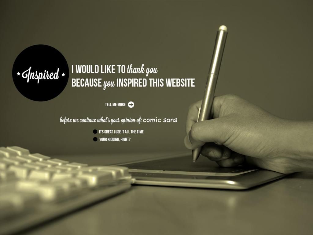
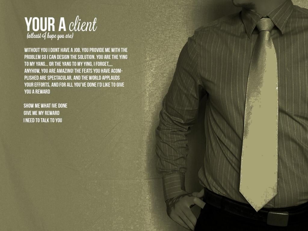
I kind of like the "green" and haha on your choice of "person" thingy thing.
Re: Thank You
Posted: Fri Nov 30, 2012 9:44 am
by joshua.miles
I like your concept. The colors and typography are working well. Instead of making the background solid you should just crop the images differently to fit on the specific resolution. Just a thought. Nice work.
Joshua
Re: Thank You
Posted: Sun Dec 02, 2012 12:51 am
by kylesmith
Looks pretty cool. Will totally live or die by the photography though. I would like to see different images that represent each page. I feel like keeping the same image for even two pages will confuse users. I also hate the block of text that is all caps. No real reason to ever do that in my book, at least for a full paragraph. If you like that look i would recommend using a font that is all caps but the lowercase caps are a bit smaller than the caps caps. That would help...sorta. IMO just make it sentence case and call it good.
Re: Thank You
Posted: Tue Dec 04, 2012 5:57 pm
by MissTinaBodden
Your designs are cool and the aesthetic is pleasing. I am just unsure on your inspiration. Also the images are a little distracting.
Re: Thank You
Posted: Tue Dec 04, 2012 6:08 pm
by miss_kristine
Interesting concept, but I like the predominant imagery and the typography so far.
Re: Thank You
Posted: Sun Dec 09, 2012 8:29 am
by treesa
I like the sepia concept, yes I think you need different images for each page. Also 'you're' is misspelled
