Project 01


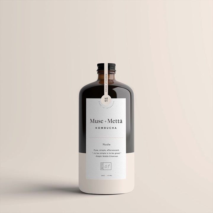
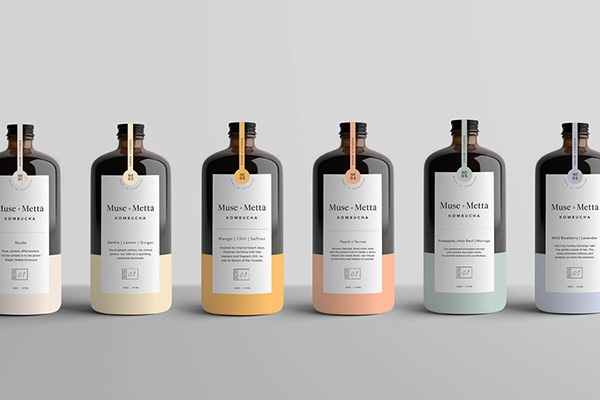
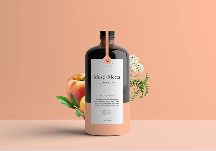
Kati Forner’s packaging design reflects her signature minimalist aesthetic, blending functionality with refined elegance. She focuses on creating packaging that is not only visually striking but also aligns seamlessly with the brand’s identity and ethos. Her use of clean lines, subtle textures, and a muted color palette results in packaging that feels sophisticated and timeless. Forner often incorporates thoughtful typography and carefully considered details, ensuring each element serves a purpose. Drawing from principles of modernism and simplicity, her packaging designs stand out for their ability to communicate luxury and quality while maintaining a restrained, uncluttered appearance. This approach makes her packaging memorable and effective, enhancing the consumer experience through both tactile and visual appeal..
