Project 02


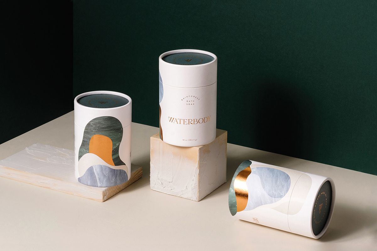
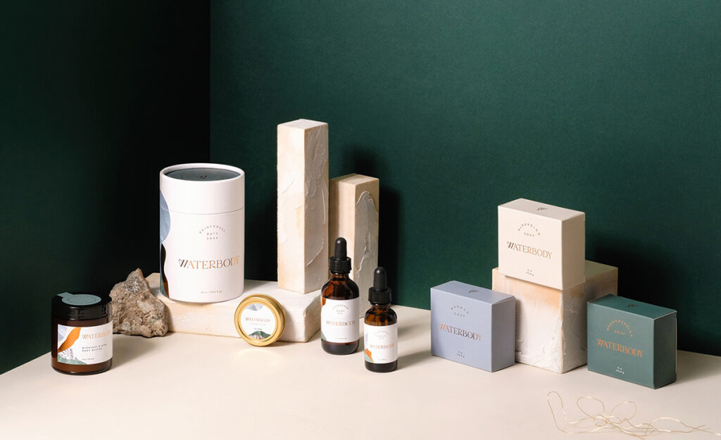
Kati Forner's packaging design for Waterbody exemplifies her talent for blending simplicity with purpose, resulting in a refined yet impactful aesthetic. For the skincare brand, Forner crafted packaging that reflects the company's natural, water-inspired ethos. She employed a soft, muted color palette reminiscent of earth and sea tones, paired with clean, minimal typography to convey a sense of calm and purity. The packaging's understated elegance aligns perfectly with Waterbody's commitment to sustainability and wellness, allowing the brand's core values to shine through. Forner also paid close attention to texture and form, creating packaging that is not only visually appealing but also tactilely engaging, enhancing the overall user experience. Her work for Waterbody demonstrates how thoughtful design can elevate a product, making it both luxurious and environmentally conscious.
