
Hi!
So the artist I chose is Julia Lepetit; they are an illustrator, writer, and designer. Really a jack-of-all-trades artist, but they are most well known for doing an art YouTube channel, where they work with three other people and create some of the most incredible art I've ever seen. Julia inspires me a lot as an artist because of their creative style, how much effort they put into their works, and how willing they are to try any form of art. So here are my roughs; let me know what you hate and love.
Project 1 Roughs
 Project 1 Roughs
- Attachments
-
-
-
- prelimvers2-02.png (1.27 MiB) Viewed 944 times
-
- prelimvers2-01.png (1.09 MiB) Viewed 944 times
-
-
-
- prelimvers1-02.png (2.64 MiB) Viewed 944 times
-
- prelimvers1-01.png (1.75 MiB) Viewed 944 times
-
- Mars
Re: Project 1 Roughs
Hello Mars,
You are off to a good start with your rough drafts. I enjoyed reviewing both versions, but the dark version is my favorite because it showcases more of the artist's work. The colors are well chosen and the font-family works well with the images. The only thing that I would have liked to have seen is your brainstorming and snag work, to have an idea of what your thought process was and to give us an idea of what your final version may look like. Other than that, I really appreciate the work that you've shared with us this far!
You are off to a good start with your rough drafts. I enjoyed reviewing both versions, but the dark version is my favorite because it showcases more of the artist's work. The colors are well chosen and the font-family works well with the images. The only thing that I would have liked to have seen is your brainstorming and snag work, to have an idea of what your thought process was and to give us an idea of what your final version may look like. Other than that, I really appreciate the work that you've shared with us this far!
According to Benjamin Disraeli, "The secret of success is to be ready when your opportunity comes". Let's make each day count!
LaTara
LaTara
Re: Project 1 Roughs
Hi, I like how you decided to make a background, it looks great a geometrical. Besides that I would be careful of the images you use. One of the images of her is blurry. Also with the social media icons, you can see the white background and where you cut it out but otherwise you're on your way!
Aubrey Delos Reyes
-
shasta_m0ri
- Posts: 19
- Joined: Wed Aug 28, 2024 6:13 pm
Re: Project 1 Roughs
Mars,
Both of these ideas are equally wonderful! I love the use of color and organic shapes. I find it hard to choose just one version, but I’m leaning a little more towards the second version. My suggestion for the desktop versions: split the body text into smaller, more readable chunks kind of like you did with the mobile version.
Both of these ideas are equally wonderful! I love the use of color and organic shapes. I find it hard to choose just one version, but I’m leaning a little more towards the second version. My suggestion for the desktop versions: split the body text into smaller, more readable chunks kind of like you did with the mobile version.
~ Shasta Mori ~
-
hazzie.jpg
- Posts: 37
- Joined: Wed Aug 28, 2024 5:08 pm
Re: Project 1 Roughs
Hi Mars,
I am very drawn to your first concept. I love the design for the home button and the contrast of your color choices that makes the artist’s work stand out and speak for itself. I think that you’re off to a great start, but I agree with our peers that mentioned the blurriness of the images and sizing of the text. Adding to what they have said, I suggest you make sure that all of your sides have the same width. This will make placing content much simpler while you're developing it. Great job! Can’t wait to see your final work.
I am very drawn to your first concept. I love the design for the home button and the contrast of your color choices that makes the artist’s work stand out and speak for itself. I think that you’re off to a great start, but I agree with our peers that mentioned the blurriness of the images and sizing of the text. Adding to what they have said, I suggest you make sure that all of your sides have the same width. This will make placing content much simpler while you're developing it. Great job! Can’t wait to see your final work.
˙˚∘⊹Hazzie Castaneda⊹∘˚˙
-
Olivia_haltom
- Posts: 55
- Joined: Mon Aug 26, 2024 8:29 am
Re: Project 1 Roughs
Hi! This seems like a really interresting artist! I like the visual direction of the first layouts the most with the brown circular shapes. Im excited to see where you go with this. I would recommend though, separating your text in the body copy!
Olivia Haltom
Re: Project 1 Roughs
Hi Mars! Great stuff like usual, I'm definitely leaning towards the Dark Academia vibes. The color contrast
just eats, and I'm loving the unique home button gallery for it. One thing to note would be the kerning of the large type,
there's just a couple areas that clash for the spacing. Overall, great job <3
just eats, and I'm loving the unique home button gallery for it. One thing to note would be the kerning of the large type,
there's just a couple areas that clash for the spacing. Overall, great job <3
Nancy Reynozo
╰(⸝⸝⸝´꒳`⸝⸝⸝)╯
╰(⸝⸝⸝´꒳`⸝⸝⸝)╯

Re: Project 1 Roughs
Hi Mars!
Julia Drawfee!!! I love your first design it speaks to the darker route. I feel Julia takes in many of their pieces, though I do think the sardine persona doesn't fully fit with that vibe! I love how it looks so far and can't wait to see where you take it!
Have a good night!
Julia Drawfee!!! I love your first design it speaks to the darker route. I feel Julia takes in many of their pieces, though I do think the sardine persona doesn't fully fit with that vibe! I love how it looks so far and can't wait to see where you take it!
Have a good night!
Thanks,
Percy Ames
Percy Ames
-
Instructor

- Site Admin
- Posts: 487
- Joined: Tue Jan 03, 2012 9:50 am
- Location: Reno, Nevada
- Contact:
Re: Project 1 Roughs
Mars,
It is always your choice to make the final decision.
I like the v1 color palette (though v2 color palette could be saved for a future site), yet I think the shark makes that page unbalance.
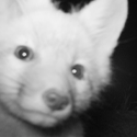
The focal point/eye is remarkable, what an interesting use of that shape!
It is always your choice to make the final decision.
I like the v1 color palette (though v2 color palette could be saved for a future site), yet I think the shark makes that page unbalance.
The focal point/eye is remarkable, what an interesting use of that shape!
If we feel useful in life and loved, it sure makes life significant and wonderful
Toni McDonough - GRC 275 Instructor
tmcdonough@tmcc.edu | 775-235-8234
Toni McDonough - GRC 275 Instructor
tmcdonough@tmcc.edu | 775-235-8234